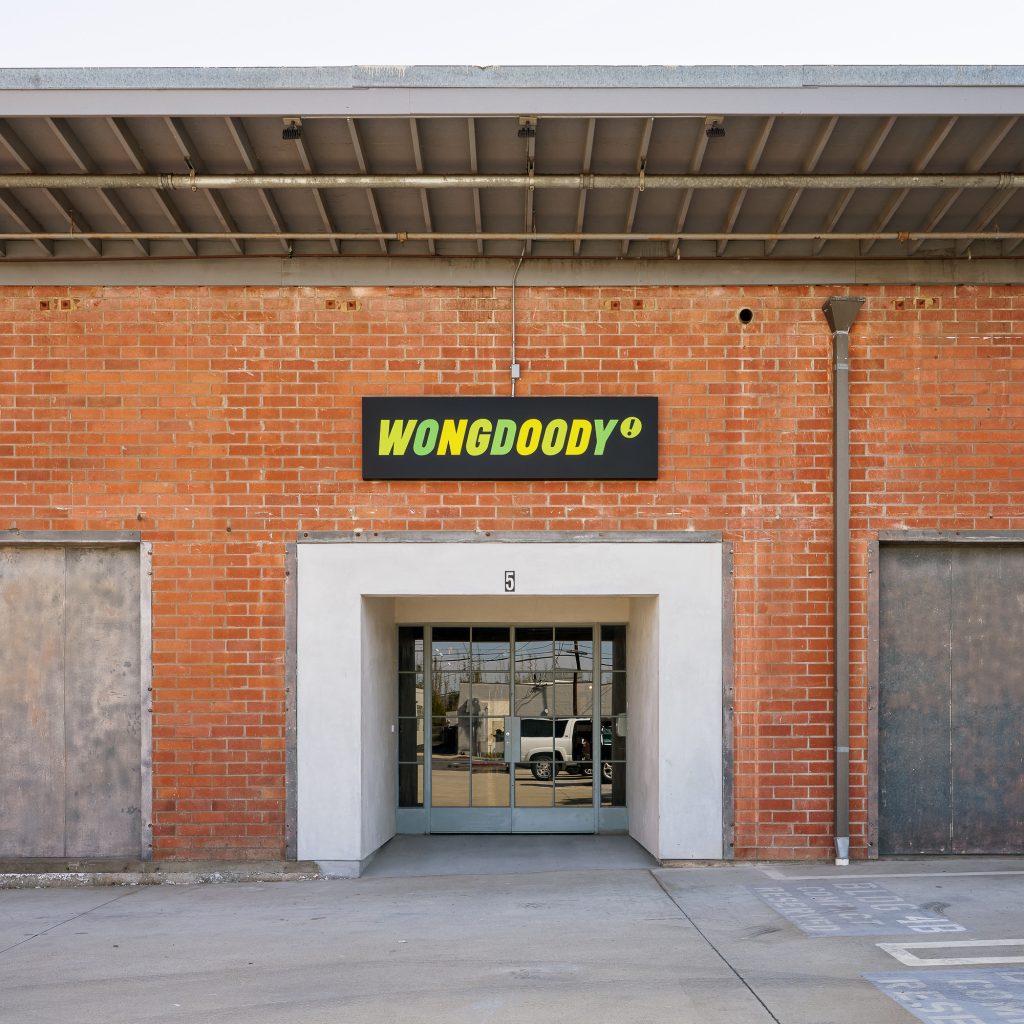
ODAA helped client WongDoody create a more collaborative and inspiring workplace post-COVID for their Los Angeles office.
Project Overview:
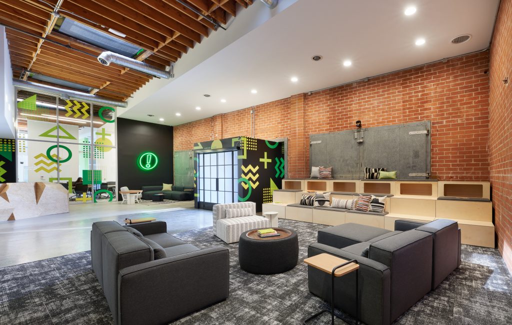
Wongdoody is a creative agency specializing in creating unique experiences for their clients across all types of platforms. A design was created that embraces today’s hybrid modern work environment for both in-person and remote employees. The workplace focuses on providing various alternative work and touchdown spaces for impromptu meetings, collaboration, and socializing. In designing a thoughtfully improved upon space for Wongdoody, there were many factors to consider: collaboration needs, entry point statement and workflow.
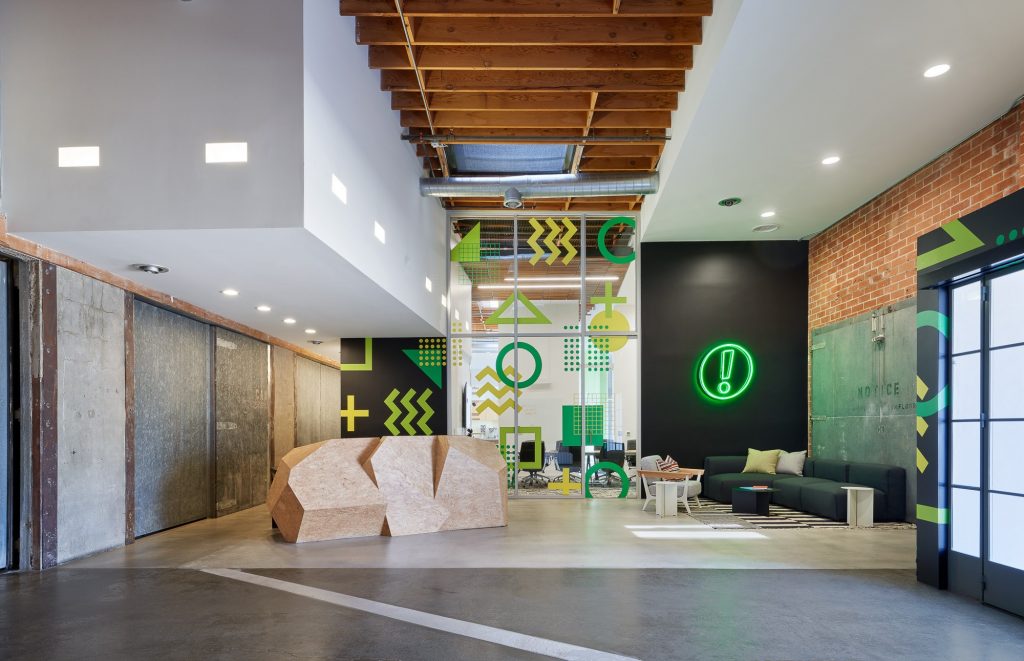
The biggest element impeding Wongdoody’s desires was a cluster of rooms built at the center of the space. By removing them, not only would it allow the natural light from the existing skylights above to pour in, but would allow for that collaborative focus to be at the center of the space, stimulating and fostering teamwork in every nook and cranny. With teams re-joining the workspace after COVID-19 impacts, the space needed to be enjoyable and something teams looked forward to working in.
In regenerating a creative workflow, it also addressed the entry point into the space. The original entry dumped visitors into a wing wall that backed the pantry space quickly into the conference room. The plan was to flip the entry into the building to the opposite side so visitors and employees entered a wide-open energetic space that would be an impactful moment to implement their creative graphics.
The goal was to inject the space with Wongdoody’s quirky and unique personality that aims for inclusivity and creative collaborative culture.
Project Planning
Routinely meeting with various end users ensured all types of workstyles and needs were met. Working with Wongdoody’s graphics team helped to plan thoughtful moments to ensure their bold quirky nature was the star of the show. Also meeting with the building owner allowed for thoughtful re-configuration of the entry point into the space to allow for ADA accessibility, and re allocation of parking spaces for clear entry into the building.
Working with The Sheridan Group, the goal was to select furniture from brands with sustainable practices and re-use as much furniture as possible.

Project Details
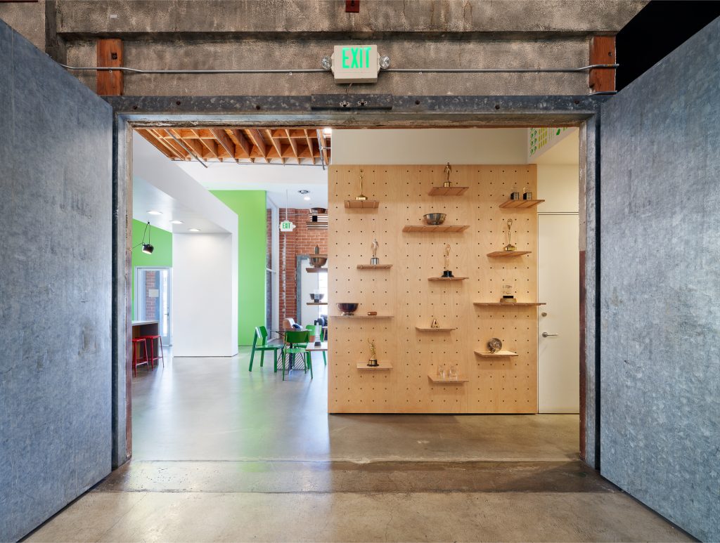
Material choices were made with sustainability in mind, with consideration to the company branding, and what worked best with the historic notes/characteristics of the building itself. In doing so, it was chosen to highlight the exposed concrete floors and exposed wood bow truss structure above. The carpet tile beneath work areas was Mohawk’s Optic Reset collection with 57% recycled content, Carbon Neutral production, and Living Product Challenge compliant. Plywood panels were used to create a flexible awards display that would remain durable over time and recyclable. Re-purposing of the existing reception desk, and electing to purchase furniture with sustainable practices was implemented.

Key Product Manufacturers
Overall Project Results
Wongdoody occupy a bow-truss creative office space in Culver City, that pre-pandemic was rigidly divided into two halves by a central spine of offices, conference rooms, and storage rooms. As with many companies through the challenges COVID-19 brought, Wongdoody was rethinking how the company will function, how to collaborate, and to use the office space.
With most employees working remotely, Wongdoody determined the best use for the office was to remove a large portion of the central spine to open the middle to connect the bifurcated sides. This provided the opportunity to create various alternative work and touchdown spaces for impromptu meetings, collaboration, and socializing. All while working towards interjecting a new culture with the hope of encouraging them to come back in some capacity. In regenerating a creative workflow, it also addressed the entry point into the space. The original entry dumped visitors into a wing wall that backed the pantry space and quickly into the conference room. The plan was to flip the entry into the building to the opposite side so visitors and employees entered a wide-open energetic space that would be an impactful moment to implement their creative graphics.
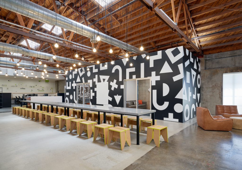
Quantifiable changes to the space were as follows:
- Removal of large fussy room build outs at the center of the space to allow for a more open circulation path.
- Large open space at the center of the space that would allow for natural light from skylights above to pour into the space.
- Re -orient the entry point into the space; allowing for an entry point that worked best for the workflow, allowed for an large all-hands team space, and created impactful graphics moments that would instantly brand the space as Wongdoody’s.
- Pull back of entry point to allow for ADA accessible ramp into the space along with a covered entry point off the parking lot.
- Re-use and thoughtfully integrate meaningful design elements; allowed for re-use of unique reception desk, and custom tables to be reconfigurable into large family style dining hall/ collaborative work table.
- Creation of bullpen for head’s down work that is close to team collaboration rooms, layout tables, and edit bays for content creation.
- Creation of awards display wall that would allow the wall to feel intentional from lightly adorned to fully populated. This piece was the focal point of the dining hall and circulation path.
- Creating dual entries into the main conference room that would allow large groups to wait in the reception, enter for meetings, and then exit out the opposing side for lunch/pantry needs.

Design Team
ODAA (oh-dah) architecture & design
Photography
Eric Staudenmaier
