BASICS Architects created a Dubai workplace for Pernod Ricard Gulf tying all their brands together through design.
Project Overview:
- Design Firm: BASICS Architects
- Client: Pernod Ricard Gulf
- Location: Dubai, UAE
- Size: 7500 sq ft
BASICS Architects was commissioned by Pernod Ricard Gulf, a French beverage company, to design their office in Dubai. The project site is located on the 14th floor of Jafza One Convention Centre and overlooks the JAFZA port, the largest commercial harbor in Dubai. The site is irregularly shaped with two arc-shaped facades faced with curtain walls and glass. The other two sides are opaque without any scope for natural light from these faces. The site has a carpet area of 7500 sq ft connected by an internal corridor around the service core of the building.

Pernod Ricard has a global working culture with its employees being an amalgamation of nationalities of various countries. The work ethics combined with the transparent work culture of the company needed a direct reflection in the design. The company with an extremely strong portfolio of beverage brands, with many of the global leaders in their category, needed them to be subtly incorporated & reflected into the Workspace design. The office also needed to be dynamic and collaborative as per the brief.
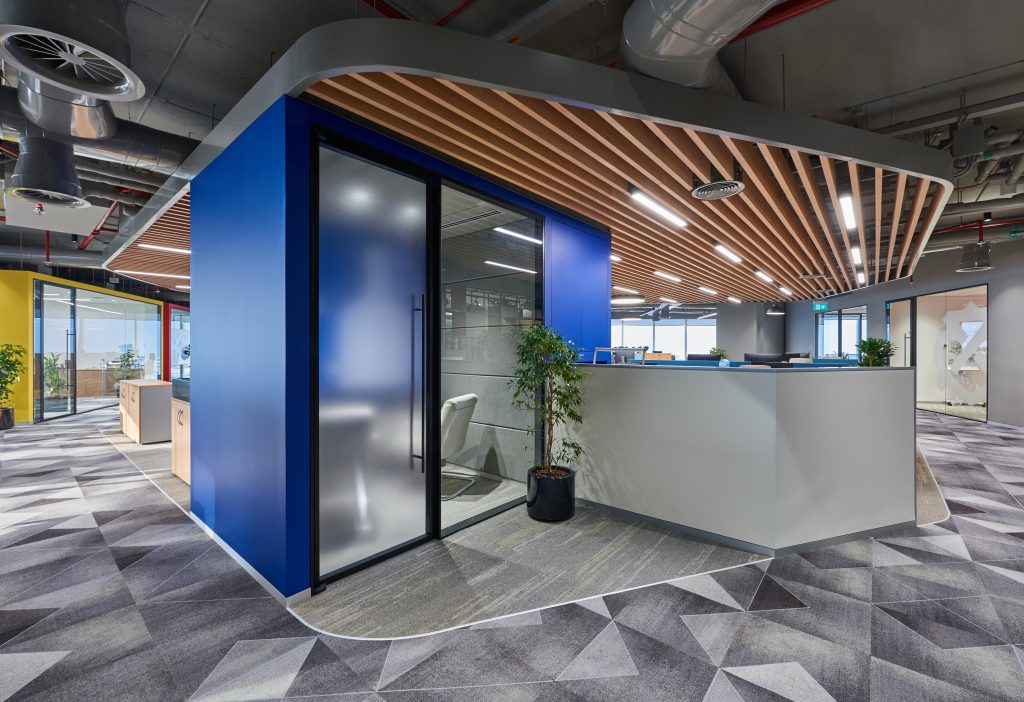
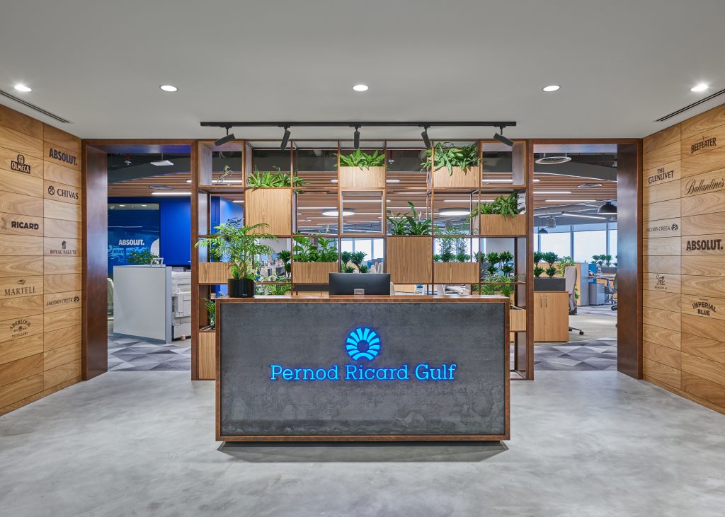
To bring the various brands under Pernod together, the basic color palette was largely kept monotone. This served as a blank canvas and highlighted brand themes that came in the form of soft furnishings, accent color pops and graphics. Each of the enclosed rooms were assigned a specific brand and general aesthetic worked around that brand. The transparency of the reception with its copper planter screen frames and wood paneled walls welcomes the users into the workspace. Natural plants add an additional natural wellness factor to the city’s panoramic view in the background. Accent colors like Absolut blue have been used as a theme for the phone booth while the Chivas and Ricard brand colors highlight the cabin’s pods.

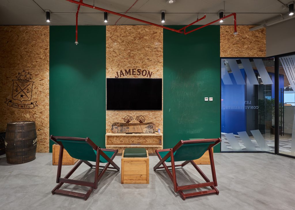
The boardroom has embossed walls with Pernod’s vision and an accent carpet which forms a signature design. The meeting rooms have been designed keeping in mind a subtle color palette. The formal meeting room is designed very elegantly in the monochromatic color palette of the Seagram’s brand. The black and white theme with gold accents works well with a formal setting. The informal meeting room reflects the Chivas color palette. It is set against a deep burgundy with copper pipes creating a charismatic backdrop. The most playful area is the staff hub that looks extremely lively with the incorporation of Jameson and Jacobs Creek branding which is reflected in the dedicated walls. Use of tinted glass, vibrant color paints, wood, copper and gold finishes creates a dynamic, fun and lively environment.
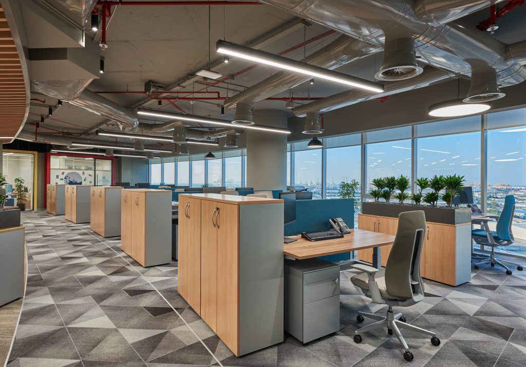
The most important aspect of functionality and comfort has been provided by using perfect ergonomic furniture. The selected Haworth desking system includes height adjustable tables which gives the users a great deal of versatility to use them as per their personal preferences. After a lot of deliberations, Fern chairs were selected to provide the best possible ergonomics.
The design of the office was an outcome of understanding the needs and requirements of the end users. As employees spend most of their day at work, other than comfort the offices need to meet the psychological demands. The very factor of transparency, usability and creativity in Pernod Ricard’s nature of work is reflected, the moment one walks inside the office space. What has emerged is a fusion of colors, materials and patterns that is a perfectly expressed notion of a bright, collaborative and dynamic workspace.

Project Planning
The awkward shape of the site provided the first challenges in terms of space planning. The arc shape combined with the trapezoidal shape of the site was offset towards the center to create an island. With two facades offering full glass, natural light was drawn into the entire work area. The third side with an opaqueness was used to create a strong backdrop for the open work area. The work area with the island extends into the reception ensuring that every part of the office not only receives natural light but also offers a majestic view of the JAFZA port. The boardroom, meeting rooms and staff hub were strategically placed to ensure privacy and easy access.
Exposed RCC ceilings and services were planned for the open office area. This gives an industrial look to the workspace but also makes the space look spacious as well. The open office concept also reflects the transparent culture of the company. The central island is highlighted by a wooden baffle ceiling which also acts as an acoustic barrier. The island became a central feature of the hall and to highlight it further, a new carpet was introduced to sync with the baffles. Great care was taken in selecting the general carpet of the office. A strong multi-directional geometrical pattern carpet was selected to blend the floor with the organic shape of the site. The enclosed offices in the open hall were treated as standalone volumes, disconnected from the main exposed RCC roof. Suspended ceilings were provided to these rooms. This helped in making the open office a large grand and singular space.

Project Details
The overall design of the project revolved around the concept of delivering a biophilic interior environment. Humans have an instinctive affinity and love for nature from our early days of evolution. To re-establish this bonding, natural materials like wood, copper, rustic materials, etc. have been extensively used. The use of concrete in the floors or even the exposed RCC roof further enhances nature within the space. The next important concept of biophilia is the use of natural light and the space planning has helped maximize this aspect. This also helps provide excellent views of the exterior as well as maintain a connection to the outside while at work. Natural vegetation, namely plants, have been used extensively in various spaces of the office. Even the use of organic shapes like the central island and general planning of the space add to the biophilic nature of the interiors.
Biophilic design within the workplace is a sound economic investment for the employers as well. It enables to harness a plethora of natural benefits for enhanced employee health and well-being thereby leading to overall workplace productivity.

Products
Lighting: Tecnolight
Glass/Glass Partitions: Saint Gobain / Kaprel
Flooring: Milliken Carpets
Air Conditioning: Mekar/Carrier
Paint: Jotun
Arts/ Branding: Sweetwater Mea
Furniture: Haworth

CONSULTANTS
Mechanical: Spacewell
Electrical: Spacewell
HVAC: Spacewell
Furniture: BASICS Architects
Lighting: Spacewell
CONTRACTORS
Civil: Spacewell
Interior Contractor: Spacewell Interiors
General Contractor: Spacewell Interiors

Design
- Vinod Singhi
- Nishant Kumar
- Taru Rawat
Photography
Courtesy of BASICS Architects


