Step through the front doors of Crunchyroll’s San Francisco headquarters and be transported to downtown Tokyo.

Muse & Co.‘s primary goal for the Crunchyroll Headquarters project in downtown San Francisco was to give the employees of the company a home, a flagship office they could be proud of, and a space that would resonate with all anime fans who love the genre. Their new headquarters had to be functional, a place for employees to meet and get work done, but as the home of the world’s leading anime streaming service, also needed to showcase the depth and breadth of anime, which is rooted in Japanese culture.
Project Overview:
- Design Firm: Muse & Co.
- Client: Crunchyroll
- Completion Date: April 2022
- Location: San Francisco
- Size: 80,000 sq ft
- Average Population: 300
Muse & Co. began with countless hours of cultural and historical research and sent members of their team to explore Japan in person. Muse & Co hired Japanese consultants and designers, binge-watched Kurosawa films, nerded out on the Sapporo ice festival, and had enlightening conversations with members of the San Francisco Zen Center. This project was a daunting task from the outset. Not only would Muse & Co have to research and design every space in the building; they would also be fabricating and installing everything ourselves—all adhering to the city’s building code, of course.

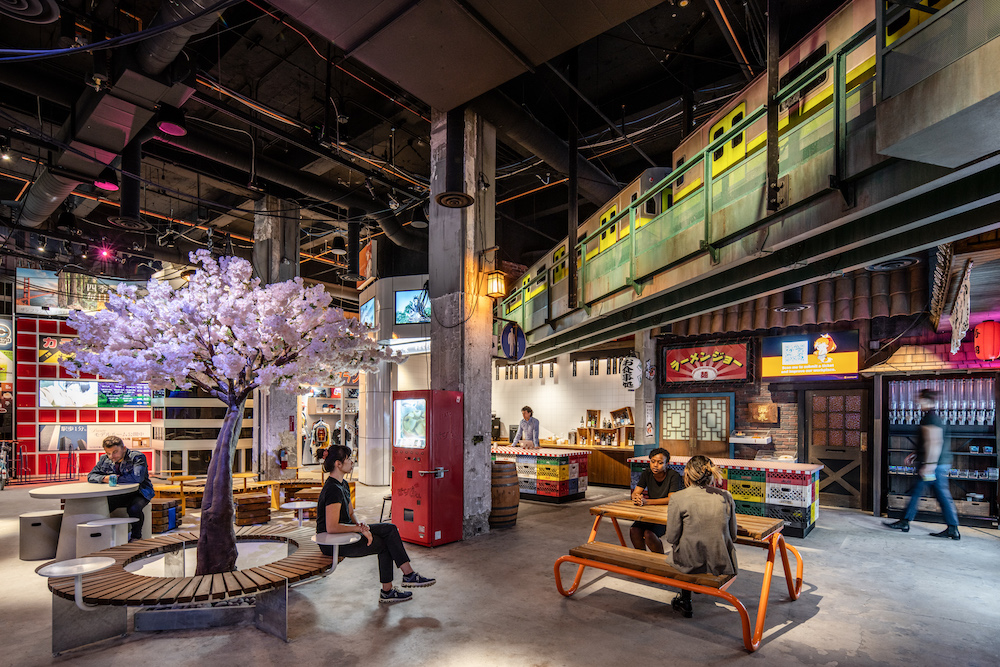
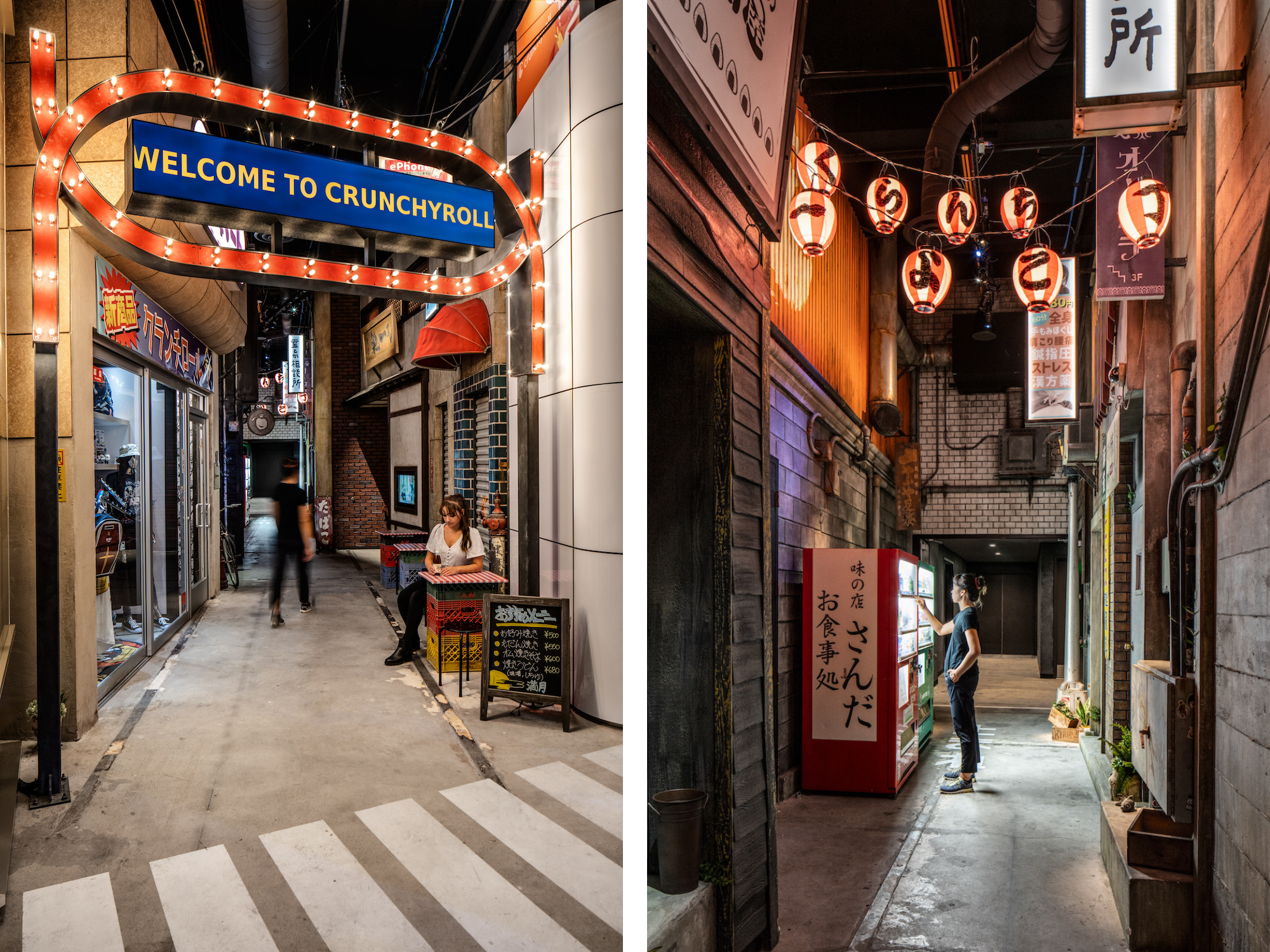
The heart of the project would be the lobby space. From the beginning Crunchyroll said: “I want people to step through the front doors into downtown Tokyo.” Muse & Co. was immediately inspired to push beyond just graphics and hints of a Tokyo “theme” and give people an authentic experience of walking the streets of a hyper-stylized city. There were challenges to this approach, to say the least. But with their interdisciplinary in-house team of designers, artists, engineers, and master fabricators, they were ready to give it their best effort.
Now that it’s complete, every moment in the Crunchyroll lobby introduces something new, just like a walk through an unfamiliar city. Around one corner, there’s a retro godzilla billboard with hand-painted lettering; down a dim alleyway there’s a storefront with Crunchyroll merch; look up and beyond a tangle of power lines and street signs there’s a commuter train suspended overhead. After Muse & Co built and installed all these elements, Muse & Co. unleashed their in-house team of scenic painters to “dirty it up,” so that everything looks and feels real, worn, and lived in. Just like Tokyo, the building is full of little easter egg surprises – there’s always something new to discover.

Functionally, the lobby includes bike parking, a public “park” space complete with a full-scale artificial cherry tree, a lounge modeled after the Park Hyatt bar made famous by Lost in Translation, an arcade, and a kitchenette based on Tokyo street markets for serving lunch and refreshments.
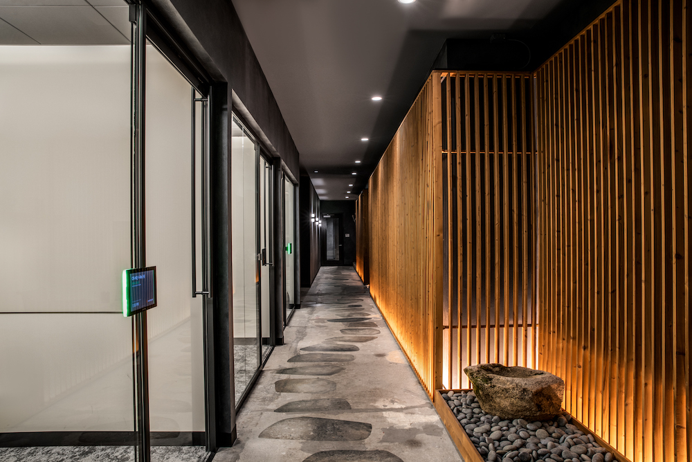
Our design approach to the upper floors, which began as cookie-cutter offices, was just as careful and intentional. Muse & Co. began by creating a distinct mood for each floor, each rooted in a different aspect of Japanese culture, and used these visions to inform the themes, color palettes, finishes, lighting schemes and plant design on every floor. It was important that every space (conference rooms, huddle rooms, lounges, kitchenettes, open office) was functional and met the needs of the employees, but was also imbued with a unique and unmistakable character—an ambiance that any individual user could identify with and call their own.

It was essential that every space felt equally thoughtfully conceived, but still distinct from anywhere else in the building; like a walk through a new city, the building reveals itself as one moves through it, but each new vista contributes to an understanding of a bigger and more coherent space. In order to guide the aesthetics of this project, Muse & Co. created a distinct mood/vision for each floor, each rooted in a different cultural aspect of Japanese culture and used that to inform the themes of all the spaces on the floor, the color palettes, finishes, lighting schemes and plant design.
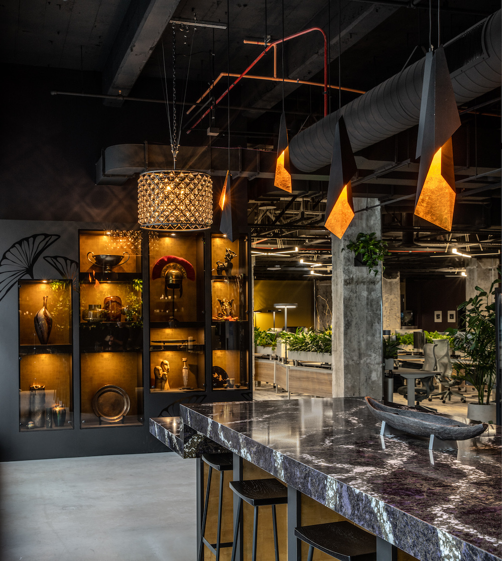
Take the second floor as an example. Muse & Co. imagined it as an “ornate, moody, opulent, and mysterious” space; “European luxury meets Japanese elegance.” Here they drew from the worlds of tradition, ceremony and high fashion for the conference rooms: Samurai suits of armor stand guard in one; an authentic, handmade kimono lends its elegance to another; the wild and eccentric style of the Harajuku district is fully displayed in a third (complete with an always-full acrylic pod of free Japanese candy).

The two lounges on that floor similarly follow the same vision: there’s a “Moto Lounge” styled after a high-end motorcycle tuning shop, and a “listening lounge,” outfitted with a top-of-the-line Hi-Fi system and stocked with cowboy bebop and vintage Japanese rock and roll vinyl. All of these spaces embody their philosophy that enabling users to actively engage with their environment leads to a stronger sense of place, and a deeper sense of groundedness and well-being in an otherwise ephemeral and interchangeable corporate world.
Even the desk layout was an opportunity to rethink the standard work environment. Rather than long straight rows of white or black desks, Muse & Co. spec’d zig-zagging desks from Watson, creating more organic pathways, finished them in dark blue and wood grain and placed a planter box next to each one. The effect is significant: each and every desk has access to the privacy, acoustic, and mental health benefits of living greenery.

When opening new offices, companies can no longer use the same “moves” as before; they are now faced with redefining the purpose of offices, and it seems they are having a hard time doing so. It’s no surprise—the ramifications are dizzying and the variables seemingly infinite. Many companies continue to design generic offices derived from “safe” and “modern” design choices that ultimately mean nothing to their employees. Others entice new hires with meaningless perks and one-off “immersive” rooms or lobby installations. Muse & Co. believes that in a post-covid world, the answer is more nuanced than either of these strategies.
When it comes to the physical design of the space, it is vital that for employees “the office” be somewhere that is perceptually different from a home or recreational place. Besides the basic functional necessities like desks, meeting rooms, and acoustics, every office should feel like an embodiment of a company’s principles, priorities and team culture. Crunchyroll is an animation company, with strong team bonding and a deep-rooted passion for the content they produce. In that sense it was appropriate to design an office that was fun, colorful, literal and at times, over-the-top.


Project Details & Products
Green spaces and vignettes were included throughout the space. Muse & Co. paid particular care to the open plan office space environment. Rather than long straight rows of white or black desks, they used zig-zagging desks from Watson to create organically flowing pathways, and placed a planter box next to each one. The effect is significant: every desk has access to the privacy, acoustic, and mental health benefits of living greenery.
The Crunchyroll project embodies the idea that a company’s cultural identity can (and should) go far beyond simple color schemes and logos on the walls. By investing in the design of their offices, companies can also invest in the mental health and well-being of their employees. Muse & Co. believes companies should create workplaces that are utterly unique to their culture, and unmistakable as belonging to no other place in “Corporate America.”

It should be clear through the physical design of the space that the employees are valued and that their time in that office can only exist in that location. This approach is the antithesis to the “work from anywhere” movement; since people are now working in all kinds of remote capacities, a physical, built space should support being present and should bolster a coherent company culture.
Muse & Co.’s hope is that their work for Crunchyroll can serve as a model for this type of design intervention and serve as inspiration for other companies seeking to design a meaningful home for their employees.

Products:
- NEON BLAZE™ Diffused LED Lighting
- Macrolon Lumen XT
- Alora Velo Mini Pendant
- Arteriors Mia Pendant Light
- Tersus LED Wall Sconce from Cerno

Overall Project Results
Muse & Co. was lucky in that they had a single-point-of-contact client who was their advocate-in-chief, and cleared a path for the work to happen. There really weren’t any difficult change management moments.
In getting the client’s approval on designs and on any changes, Muse & Co. was very particular about the way the stories for every design was crafted using very clear precedent imagery, floorplans and renderings and talking the client through those and how they fit into the larger design strategy. Having design check-ins every couple weeks was very helpful to keep the client engaged and signing off on designs so that by the time all the designs were done, there were really no surprises.
The building is still unoccupied due to covid.

Project Summary
- KBM Hogue – Furniture
- SenovvA – AV
- Salas O’Brien – Architect of Record
- Jason O’Rear – Photography credit

