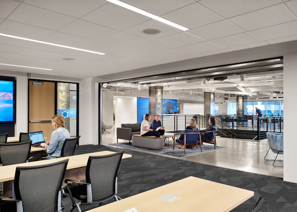
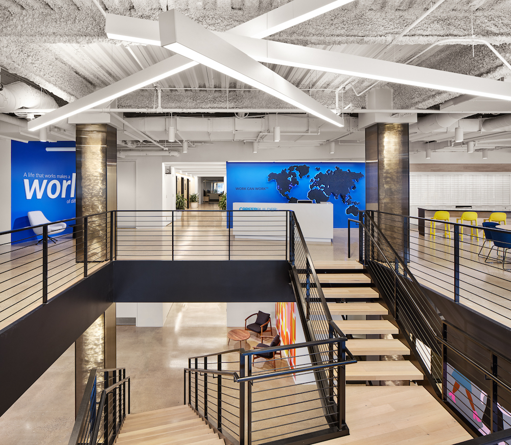
CareerBuilder’s sophisticated yet minimalist HQ promotes health, wellness, and inclusion as Perkins and Will worked closely with employees regarding what they wanted to see in their new space.

Perkins and Will’s Austin studio team recently completed a full interior renovation of CareerBuilder’s HQ in Chicago. The online employment website engaged Perkins and Will to create a workspace that is sophisticated, yet minimalist, and promotes health, wellness, and inclusion amongst employees. Mindful of the wants and needs of the occupants-to-be, the design team worked closely with employees regarding what they wanted to see in their new 75,000-square-foot workplace.
Some highlights from the space include a strategically-placed uplight to help reduce glare and eye strain; workstations that were outfitted with height-adjustable desks to encourage movement throughout the work day; and smaller breakout spaces that were constructed to allow employees additional spaces for heads down work or collaboration.
When was the project completed?
July 2019
How many SF per person?
135/SF
How many employees work here?
540

Describe work space type.
The new HQ is an open-plan concept that houses executive and administrative staff, and sales, in an inclusive workplace. Aiming to strip the space of hierarchical design, Perkins and Will integrated low partitions and benching-style workstations for a more horizontal organizational structure. Given the open office plan and fewer private offices, an abundance of conference rooms and phone rooms were integrated to provide employees with breakout spaces for meetings and quiet focus.
What kind of meeting spaces are provided?
Conference rooms, phone rooms, smaller breakout spaces, and a training center is separated by a garage door, which allows for the center to be acoustically isolated when needed and open when not in use.

What other kinds of support or amenity spaces are provided?
The space includes a wide reception area, which serves as a large hub together with a multi-use lounger and pantry space.
Has the project achieved any special certifications?
Every effort was made to be sustainable in the renovation, but no certification was applied for.
What is the project’s location and proximity to public transportation and/or other amenities?
The project is located at 200 N LaSalle Drive and is one block away from the Clark/Lake Subway Station.
Was the c-suite involved in the project planning and design process? If so, how?
Some members of the c-suite worked along with the steering committee (named ”the space cadets”) to help visualize the space and identify needs.

What kind of programming or visioning activities were used to create the space?
Multiple sessions were conducted to envision the programming and activities intended for each space. It started with the Perkins and Will Planning and Strategies team helping CareerBuilder develop the overarching space requirements and goals with the project. This included helping to develop a major cultural shift of a more closed off workspace to an open space with collaborative spaces to support. After the programmatic requirements were developed, other sessions were conducted to help understand the atmospheric and aesthetic goals for the space.
Were any pre-planning surveys conducted to get employee input?
Perkins and Will designed a sophisticated yet minimalist interior informed by the valuable input of CareerBuilder employees from various departments who helped pinpoint day-to-day necessities. Throughout the design process, the staff was polled on various aspects including what workstation and chairs they liked the best as well as selecting a finish palette for the office.

Were there any other kinds of employee engagement activities?
Throughout the process there were quite a few employee engagement activities. There was a demo-day kick off where employees were able to start demolishing and say goodbye to their previous space. Involvement was kept throughout (mentioned above), and then at the grand opening there was an opening-day kick off party.
Were any change management initiatives employed?
Mostly described above, with keeping employees engaged throughout the design process and making sure employees knew what was coming, but still leaving an element of surprise for the new space.

Please describe any program requirements that were unique or required any special research or design requirements.
For CareerBuilder, having a central connected space was brand new to them, which has been named “The Hub”. It provides a central connection area and a place for people to both be social and work, relying on some of Perkins and Will’s previous workplace research.
Due to the location directly off the L Train, sound was a concern. Previously a double wall system was employed to help mitigate some of the noise, but after being studied further, it was concluded that it wasn’t providing much benefit to reducing sound and was instead causing a lot less natural light to come in, so the double wall system was removed.
Was there any emphasis or requirements on programming for health and wellbeing initiatives for employees?
Yes, employee health and wellbeing was a top priority for the redesign. Consequently, uplighting was installed in the open office to help reduce glare and eye strain. All conference rooms were placed near the windows to have natural light, workstations were equipped with height-adjustable desks and small breakout spaces were added to encourage employees to get up and move around. In addition, the staircase in the office connects all the floors and invites employees to use the stairs and not the elevator.

Were there any special or unusual construction materials or techniques employed in the project?
The design played off the existing structure of the building, and materials were specifically selected to highlight this strategy. Directly off of the lobby, the stairs are flanked with two columns wrapped in polygal, which is typically more of an industrial material. This helps to both showcase the rough column and to enhance its beauty. This also emphasizes one of the key concepts of “Beneath the surface”. Also to play off of this concept, the elevator lobby exposes the plenum painted a bright color, but only when you look straight up, the slats camouflage it if you look forward.
What products or service solutions are making the biggest impact in your space?
The biggest impact is the adjustable height workstations from Steelcase. Not only does this provide an opportunity for employees to have different postures throughout the day, but to set a height that is appropriate to the individual.
Within the open office, various lounge pieces are provided to give employees a place to go throughout the day and allow different positions to work in, not only sitting at a desk but also sitting in a lounge chair or high-top table.
Ancillary manufacturers include: DWR, Geiger, Sandler Seating, Stylex, ERG, Paul Brayton, Blu Dot, Bernhardt, Andreu World, Grand Rapids Chair Co., Emeco, Hightower, Sitonit, Pottery Barn, Softline, Room and Board, West Elm, JSI, Dauphin, OFS, Allermuir, and Davis.
Workstations / task chairs, we used: Workstation – Steelcase worksurface, Steelcase powered beam, Steelcase dividing screens, AMQ height-adjustable base, Three H mobile ped/storage, Humanscale wire management.
Task chairs: SitOnIt Torsa.
For other finish or lighting specs, some manufacturers include: Tandus, Stone Source, Ceramic Technics, Johnsonite, Tarkett, Rockfon, Wilsonart, Polygal, Silestone, Benjamin Moore.

What kind of branding elements were incorporated into the design?
To accommodate CareerBuilder’s brand, the design team utilized a neutral base palette for the interior color scheme accented by the thoughtful use of company branding colors and graphics. Various branded graphics throughout the space encourage activity and interaction, such as a magnetic block wall, 211/212 degree ping pong ball feature, and rotating photo elements.
What is the most unique feature of the space?
The most unique characteristic of the space is the centrally-located feature stairway. The stairs function as the main artery connecting all levels, framed by two exposed columns, encased and illuminated within corrugated polycarbonate sheets that display the building’s industrial interior.
Are there any furnishings or spaces specifically included to promote wellness/wellbeing?
Workstations were outfitted with height-adjustable desks, while the dispersion of smaller breakout spaces encourages employees to move around the office throughout the day. All conference rooms were strategically wrapped around the core, allowing natural light to permeate the office throughout.
What kinds of technology products were used?
Updated technology was brought to all conference rooms, utilizing Zoom technology.
If the company relocated to a new space, what was the most difficult aspect of the change for the employees?
Fear of the unknown is always a challenge. Along with change management, this helped mitigate some of these concerns.

If a change management program was in place, what were the most successful strategies?
Keeping the staff informed has proven to be the most helpful element on this.
The team who contributed significantly to this project:
Architect: Perkins and Will
General Contractor: BIG Construction
Structural: Simpson, Gumpertz & Heger
MEP: ESD Global
Furniture: Forward Space


This is inspiring. I love space ideas. This is helpful especially when you are moving to a new office or renovating an office.