When Ice Miller Chicago was presented with the opportunity for more space on the floor above its existing office, the team engaged NELSON Worldwide to expand and renovate its 200 W Madison Avenue location.

With seven offices and 350 lawyers across the United States, Ice Miller has positioned itself as a law firm dedicated to providing personal service and valuable, sophisticated legal counsel to its clients. When its rapidly growing Chicago office needed more space, Ice Miller was presented with the rare opportunity for additional, contiguous space on the floor above its existing space. The firm enlisted NELSON Worldwide to expand and renovate the offices at its 200 W Madison Avenue location.

Project Overview:
- Design Firm: Ice Miller
- Client: NELSON
- Completion Date: April 2022
- Location: Chicago, IL, US
- Size: 50,000 square feet
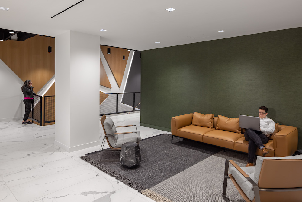
Ice Miller was looking to truly connect its lawyers and staff despite now being on two floors (the 35th and 36th). A staircase was established as a way to bring together the main event functions of the space, while also providing easier visibility and access between teammates. Finding the appropriate space to build such a staircase was one hurdle that the team needed to overcome, considering how important it was to drive connectivity and engagement throughout the office. In addition to physical movement, the staircase enables lawyers and staff to come together to walk and talk or step to the side to engage in conversation.
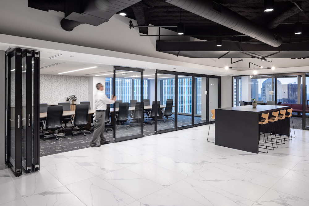
The overall concept for this project was “the intersection.” Ice Miller prides itself on celebrating the diverse minds within the organization and the power of bringing those together to provide clients with better solutions. Thus, the space needed to support and celebrate that collaboration and connection that makes the organization so great. By physically locating the conference center, reception, event space, and multipurpose room at the heart of the 35th floor and the event space, conference space, and café at the heart of the 36th floor—connected by a beautiful, open staircase—it created a space that every single employee would need to pass throughout their day. This leads to moments of both spontaneous and scheduled interaction among teammates.

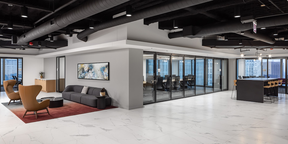
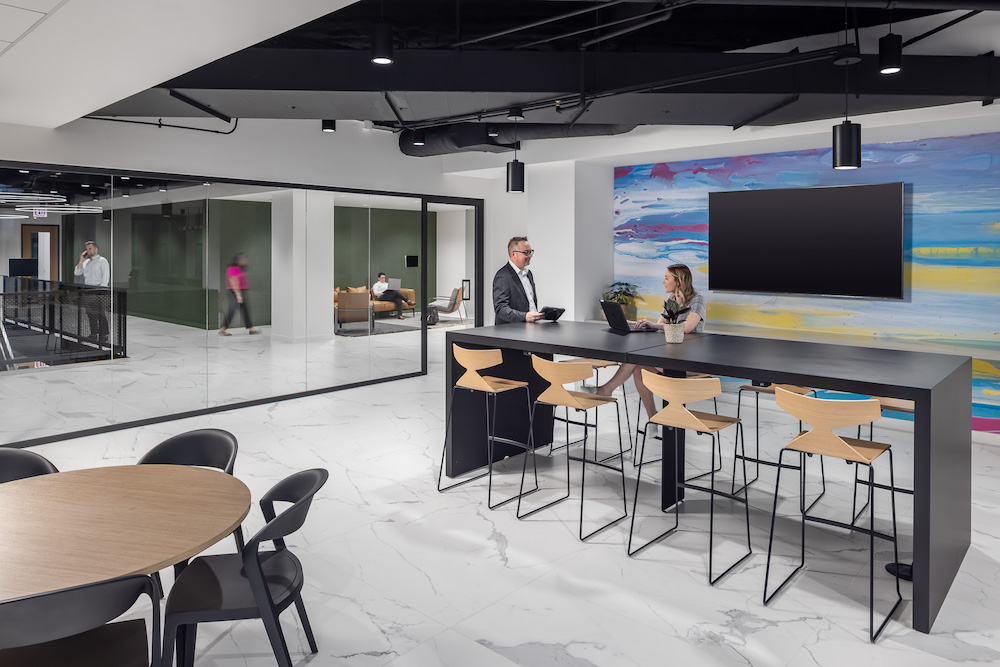
To further support this concept of intersection, Ice Miller, which represents clients across many industries, including technology, wanted the space to feel more comfortable for its clients. The design team accomplished this by opening the ceiling to the deck to expose the structure and supporting equipment, giving the space the feel of a law firm with a more tech-focused office look. The exposed area and ductwork were painted black to blend with the shades of green, wood tones, cool and crisp whites, and rich jewel tones selected for the office. The design scheme was made to feel comfortable without being too opulent, and to have a tech feel similar to many of the clients they represent. Through the exposed ceiling, one can see the beams and the structural pieces intersecting. This is more than a beautiful design—it is an opportunity for symbolic design features and a reflection of the overarching concept of intersection and how individual members can come together to reinforce one another and make the overall space stronger, like Ice Miller’s teammates do for the organization and its clients.
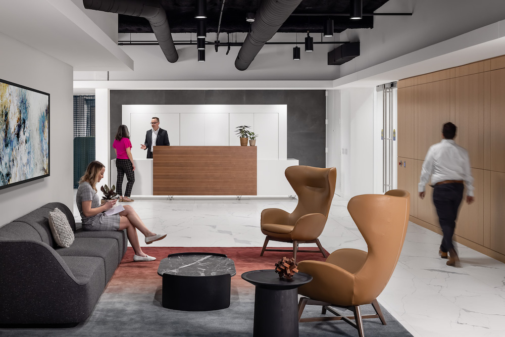
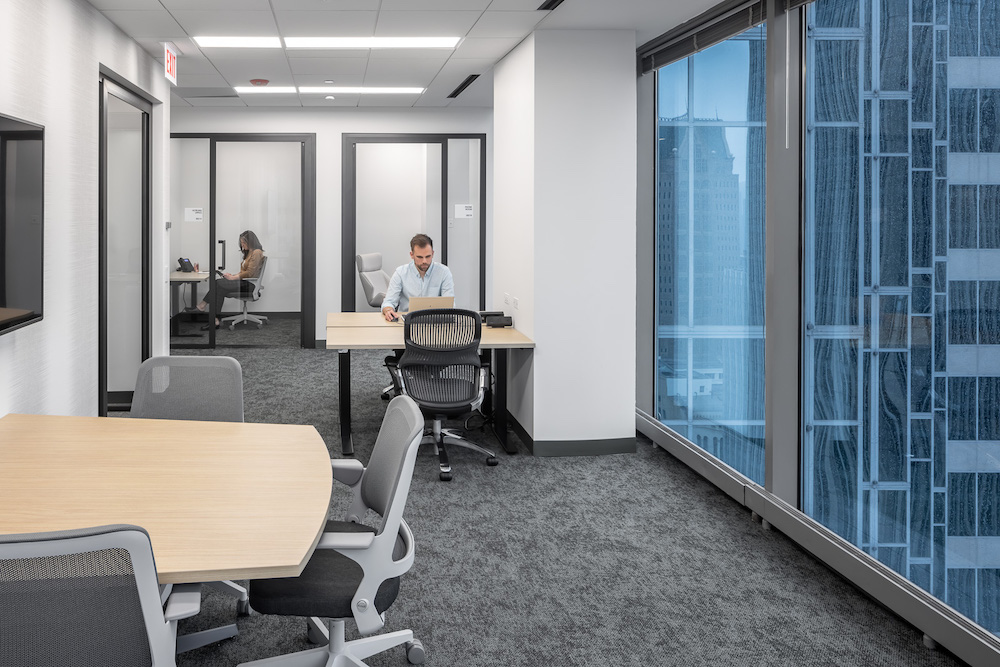
Unlike its previous office layout, Ice Miller took a step away from large corner offices that were once reserved for senior partners, and instead incorporated universal-sized offices to promote equality and efficient use of real estate. The corner areas are now used multi-functionally as office hubs, or areas where lawyers can come together for collaborative work or take private calls, or space for visiting attorneys from the firm’s other offices. As opposed to hot desking, providing office hubs, conference rooms, and phone booths allows employees to step into a private space to take a phone call or do heads-down work.
The café was a critical part of this project—putting it on the prime view and with full access to natural light allows the lawyers and staff, who make a point to eat together, to utilize the space more. With a variety of seating types and full glass front, the café is visible right off the 36th-floor elevator lobby and is the first view you have when you ascend the staircase. The redesign incorporated flexible space, including its reception area, which can open up to accommodate a large meeting, a seminar, or a social gathering. The main wall in reception is designed with white oak panels, and upon closer inspection, one can see masked hidden doors that can be opened and used by a bartender to serve from during an event. The firm no longer needs to find another venue when it brings in a speaker or provides continuing learning education programs, which often draw larger audiences.

Overall, the new Ice Miller space gives the wow factor that the firm was looking for to impress clients and attract and retain talent. It is a more functional space that supports the organization’s pillars of transparency, equality, and collaboration, and will withstand the test of time without a large price tag.

Project Planning
The team coordinated with the corporate real estate and facilities team in conjunction with the local office leadership throughout the design and implementation of the project.
The entire office was surveyed to better understand how the current space was working for them and where there was room for improvements. A select group of local teammates were involved in the project visioning session and all subsequent design presentations, furniture, and finish selection processes.
Project Details & Products
It was really important to keep the main meeting/event zones open to the deck and not enclose the ceiling. The design team wanted the structure, which all met in that portion of the building, to be showcased and to support the design concept, “Intersection”. In order to maintain the acoustic privacy that is required in a law firm environment, K-13 spray was chosen to allow visibility to the structure, gain ceiling height all while providing acoustic integrity.
It was important to provide transparency and flexibility of the space so the same space could function for private meetings as well as large social events. By using the DIRTT Leaf glass wall system and Nucraft Approach moveable tables we were able to provide Ice Miller with a space that could function for board meetings, entertainment space and everything in between.
Training was very important to Ice Miller but providing space that could only be used for that function wasn’t providing enough flexibility. The use of Modernfold’s manual wall system provided an internal training space that could also be used for all-hands meetings and larger events.
Transparency, and providing daylight and views to all was very important. Thus, using Teknion Tek Vue walls for office fronts was a key part of the design solution.
The internal stair was a key feature of the design. Supporting the theme of “Intersection” the stair is the center of the shared space on both floors. It not only provides a place for teammates to bump into one another throughout the day and is a visual feature the moment you walk into the space, but it was strategically placed in an area of the floor plate that provided a view to the building’s structural members which all intersect in that same area of the building, reinforcing not just the structural integrity of the building but emphasizing the importance of coming together for the greater good.

Overall Project Results
At this time, no post-occupancy surveys have been completed as Phase 2 is about to start construction. We typically wait 9-12 months post-move in to survey.
The design team considered painting the open ceiling a darker tone early on in the process but one of the key features the client asked for was a space that was light and bright. Therefore, it was determined to paint the ceiling white. After the ceiling was painted out and the client saw it, they decided to paint it black. This really helped emphasize the views and stair in the space and provided a great contrast to the light, bright flooring. The design team was shocked at the decision but we feel it really helped with the hope of providing a space in which their clients (quite a few being tech-focused) can feel more at home.

Project Summary
- General Contractor: Skender Construction
- MEP/FP Engineer: Kent
- Main Furniture Manufacturer: Knoll
- Glass Fronts Manufacturer: Teknion
- Operable Wall Manufacturers: DIRTT & Modernfold
- Furniture Dealer: Corporate Concepts
- Main Flooring Manufacturer/Installer: Bentley Mills
- Photography credit: Brandon Stengel

