NeoCon’s recent virtual program examines how social media has changed communication about design not only with clients, but peers too.
Websites like Apartment Therapy and Houzz, social channels like Instagram and Pinterest, and TV networks like HGTV have given the world 24-7 access to design ideas and inspiration. This growing interest in design is a welcome, natural development. People have an innate attraction to beauty, and wider participation in the design process only enriches the result. The challenge is that, while everyone may have their own ideas and opinions about design—and, thanks to the plethora of free design apps and inexpensive software, the tools to practice it—not everyone is a designer. Great design doesn’t emerge from a well-curated Pinterest board or hours of binge watching a show. Instead, it’s the product of education and experience, inspiration, and rigor. HOK’s workplace design teams have always worked to solve problems and improve the human experience. That will never change. What is changing—even more so as we reimagine aspects of the built environment in response to COVID-19—is our culture’s heightened awareness of design.

With an abundance of social media platforms sharing of design ideas and inspiration, presenters Tom Polucci, Firmwide Director of Interiors, HOK, and Mike Goetz, Senior Project Designer, HOK discussed how it has changed the dynamic communication about design not only with their clients, but their peers.
The title of the presentation, “Designing Under the Influence” is so appropriate. We have as a society been captured by social media in so many ways that have filtered down to how we perceive information. For designers and their clients it is another way to initiate a dialogue but, on another level, it gives the client the impression that they know a lot about design.
How do you channel their enthusiasm and ideas into actionable input for working on developing a design concept?
Mike Goetz: When a client either presents us an image or responds strongly to one, we dissect it with them: what is there about that image that you like? Are you responding to the color? the texture? How does that align for your goals? Those are great starting points, but we really need to unpack the different elements of that image and see what they’re really gravitating towards.

Tom Polucci: We have to challenge our clients to understand why are they pulling something? And is it personal? Or is it truly reflective of the culture of an organization? And if it is truly about that organization, who are they to tell us whether it’s right or wrong? You know, if it’s coming from the head of real estate, but not from the CMO (Chief Marketing Officer)? Who gets to speak for the organization? How do we know that this understanding comes from the top?
Years ago we worked for a celebrity client in LA. Her leadership was telling us that there was a certain aesthetic driver that was important and meaningful. However, when the design was finally presented to the client, she said it was not what she’d asked for or meet her expectations. The assumptions made by her senior leadership team did not reflect exactly what the leader really wanted. And that’s our goal, to understand all of that. That might involve using imagery collected by the client or collected by ourselves. What’s tremendously important is that we get all the right voices involved, and all come out with an understanding of the aesthetic goal or direction. There have always been trends.
Is there a viable way to work around what is trending, yet provide inspiring design solutions that meet the unique needs of the client? Given the choices aren’t there options to do so without just using the most popular items on the market?
Tom Polucci: we have to recognize that what comes around goes around. For example, we’re in a warm metal phase now but for years the preference was for cool metals. You couldn’t show a client brass or gold, in terms of the metallic finish, yet now everybody wants it. Yet this will change. Our job is to decide what the quality and impact finishes or materials will to make. For instance, hardware is going to be a long-lasting element in an environment versus a chair or a paint color. And sometimes we need to make some choices that might be on trend, because we’re designing for something that is in the moment, and important to a client. But we should be directive in terms of where to use those resources in an effective way and say, ‘we hear you, you want millennial pink,’ if it makes sense to the to the client for the overall design concept. But let us tell you that this will go out of style. And it should be on something that’s changeable.
Mike Goetz: It all goes back to asking if these current trends or design elements support your overall design concept and just then we need to be mindful of how they use it. If it’s woven into the overall story and space that you’re crafting, then it’s going to give it more longevity, versus if you’re just doing a trend piece to do a trend piece. If it is just a curation of trends, that it’s going to date quickly because it’s doesn’t have anything behind it.

And then there are ideas that just feel temporary in nature, which might not be bad. If it’s an organization that intentionally plans to refresh or change a space every five years, that makes sense. It would be interesting to have a client say they’ve made that kind of commitment and the space would be more like a hotel, which you typically refresh every seven years.
Tom Polucci: What’s interesting is looking back at spaces and look at a material like wood. We’re in a white oak phase right now and before that we were in a walnut phase. And before that it was cherry and maple. As designers, how do we detail those things? How do you treat that materiality? There are some spaces that are 15-20 years old that might have all been done in cherry but, if they were done in this beautiful, refined way, they might still hold up today.
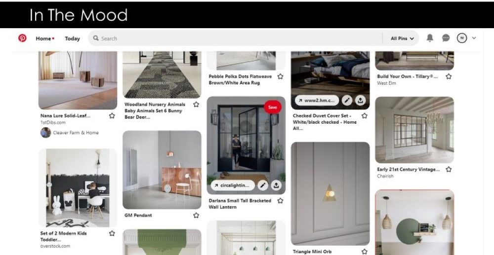
What are the best questions to ask when trying to figure out a client’s over-riding goals for their space? If they have been inundated with what is trending how do you get them to look past their Pinterest mood boards and favorite Instagram feeds?
On the one hand the explosion of “design” social media is immediately available to everyone, amateur and professional. You do delve into the use of these as tools to pursue the conversation with clients to elicit their reaction or find out likes and dislikes.

Can you speak to how to utilize these tools responsibly, and as a learning device and not a crutch? Also, can you give an example of how the use of social media has enhanced the ability of designers to communicate with their clients in a positive way?
A firm-wide effort produced HOK Forward: Design in the Digital Age – where the team researched six different subjects that affect design. The presentation touched on each subject, and we encourage our readers to read the full publication here.
Mike Goetz: The imagery should be connected to specific goals. We shouldn’t start with the imagery and try and create goals from that. I think that’s the problem that Pinterest and other sources of inspiration create, because we’re skipping the key discovery of the root of what we’re trying to design and just going to the end result and backing in justification as to why we’re making these design decisions. Instead, you need to understand the client: understand their goals, how they operate, who they want to attract and retain, what’s their vision for the future, what kind of company they are. Then take those principles and apply them to space.
However, because most of the time we’re interacting with people that aren’t designers, imagery is the easiest way for them to articulate their likes, dislikes. I like to use imagery to establish a common language. When you say ‘open,’ it means something specific to you, but it may mean something different to me. By associating a word with an image, you gauge exactly what they mean. You can use an image or social media post as a Rosetta Stone. But I try and get to the bottom of what the image is supposed to represent versus a copy paste application into a space.

One of the benefits of social media is the ability for less-established brands and designers to share their work. We’re always inundated with information from the major furniture manufacturers, but you can also go on Instagram and see who’s making what in the local market, you can shop small. Local nuance really needs to be a part of space. Social media is a great way to find those new resources.
Used wisely and in the larger context of design inspiration, “Designing Under the Influence” can be a positive experience, but it is not a substitute for the careful research and curation that informs a truly well-designed space!
Connect with HOK:
LinkedIn | Instagram | Twitter | Facebook | YouTube
This article is supported by the following 2021 NeoCon Exhibitors:


