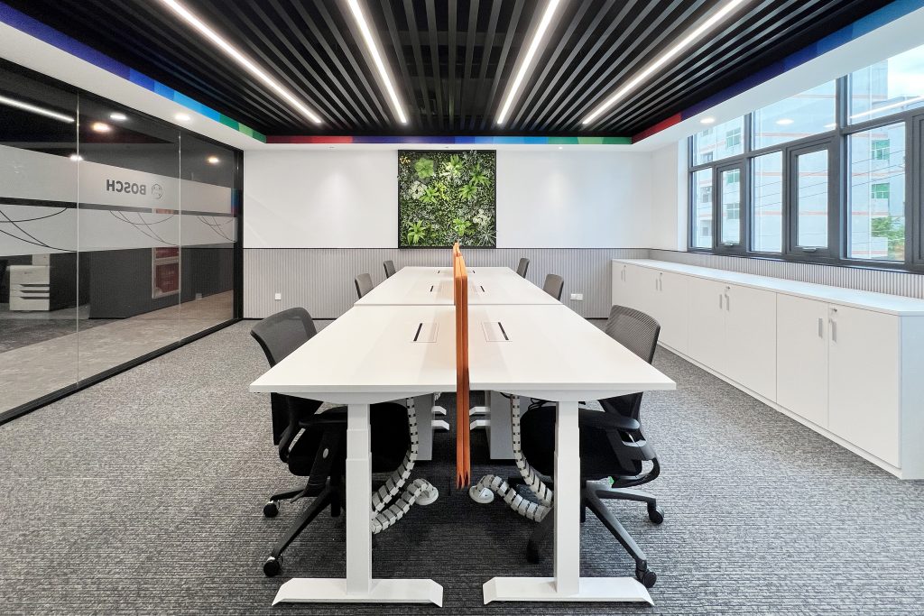
LAPIS BUREAU (LxB) worked with BOSCH to implement their new corporate guidelines and brand visuals at their Shenzhen office.
Project Overview:
- Design Firm: LAPIS BUREAU (LxB)
- Client: BOSCH
- Completion Date: 2023
- Location: Pingshi Longgang District, Shenzhen, Guangdong Province, China
- Size:1520 sqm of total interior design over 3 floors, about 500 sqm footprint per floor (16,361 sq ft)
Situated within BOSCH’s industrial park in the Pingdi Longgang district of Shenzhen city, consisting of several building and factory facilities scattered across the enclosed campus. Lapis Bureau was commissioned to transform a 20-years-old office building into a newer and fresher aesthetic that could match the more recent and modern facilities of the campus, while implementing the functionality of the interior spaces, envisioning the establishment in here of their new corporate offices, following BOSCH’s international standards, as well as inserting new functions that could be collateral to the whole campus such as a state-of-the-art showroom, expansive conference spaces, and a new larger canteen to be relocated here, catering to both employees and factory workers from the campus.
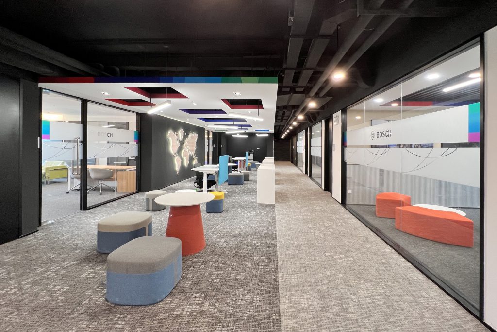
Functionality and colorful aesthetics were merged creating an open workspace that inspires creativity, innovation, and collaboration in the BOSCH Headquarter Office in Shenzhen, in line with their latest corporate guidelines and brand visual identity.
The interior design at the Bosch Headquarters in Shenzhen is not just a project; it’s a bold statement that resonates with Bosch’s commitment to innovation and excellence, aligning the new design with Bosch’s latest brand guidelines released in 2023. This visionary move encompassed updated visuals, logo, patterns, and color schemes, ensuring that the design reflects Bosch’s evolving identity while providing a comfortable working environment within a modern and appealing look.
The renovation of the entire building was a comprehensive endeavor, beginning with the exterior facelift and extending to three entirely renovated floors of interior spaces. On the third floor, which houses the new headquarters offices, the design aimed to foster a sense of unity, creativity, and productivity.
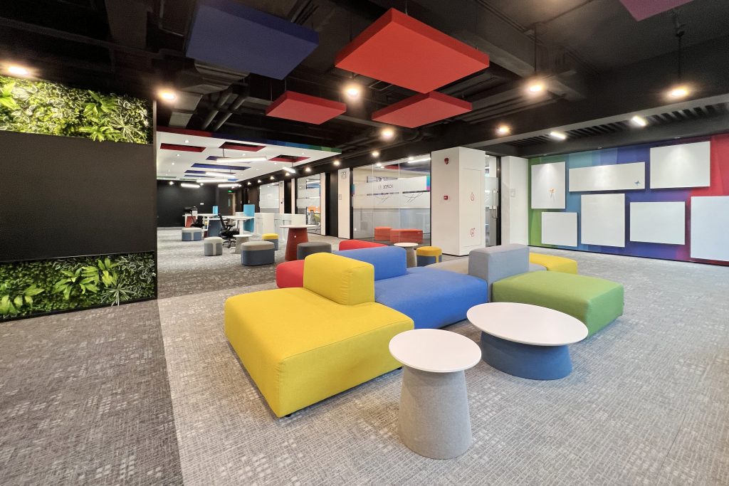
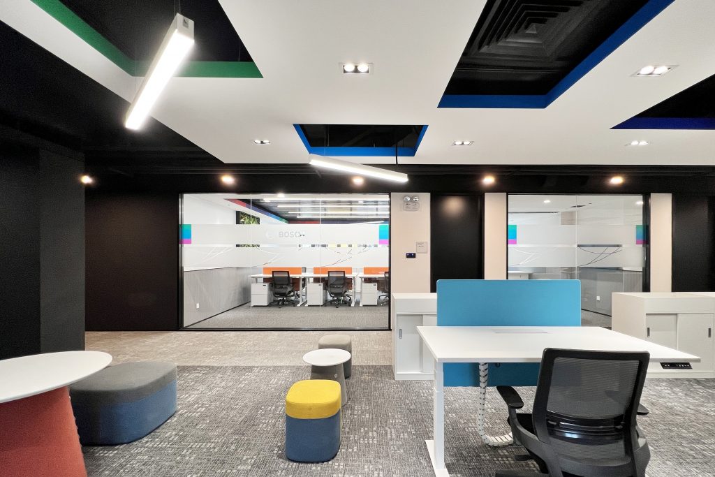
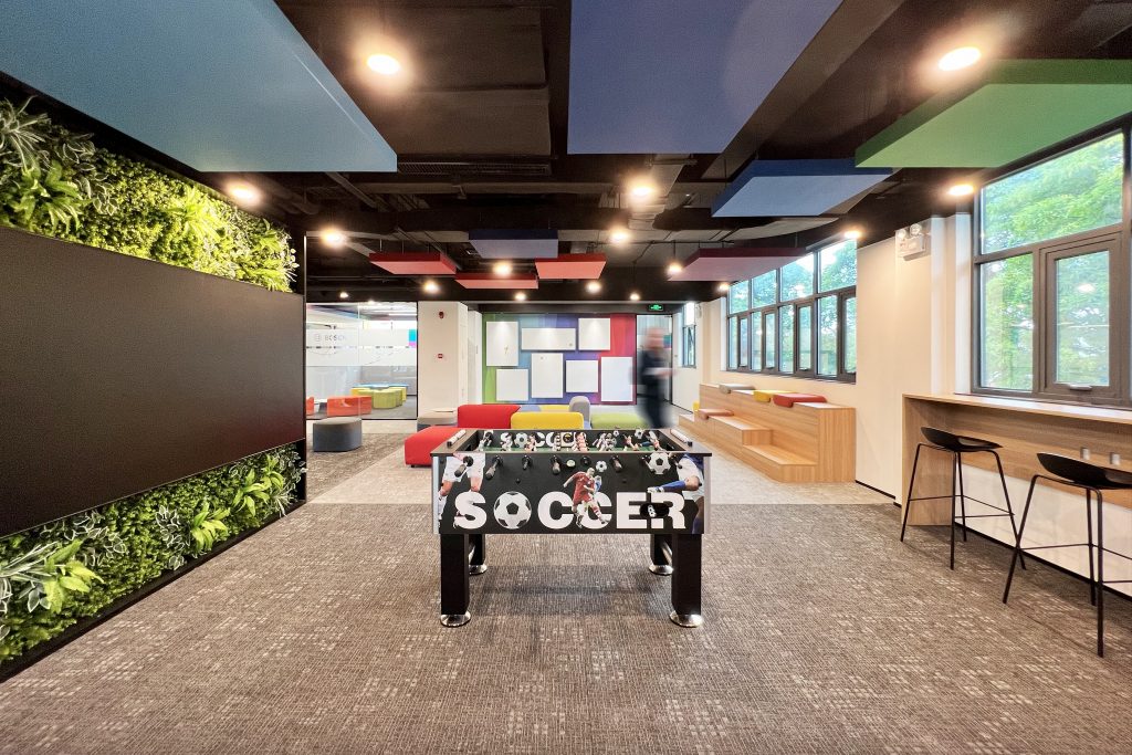
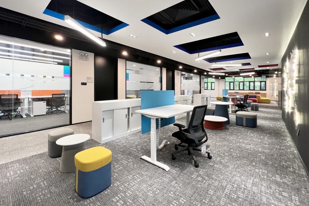
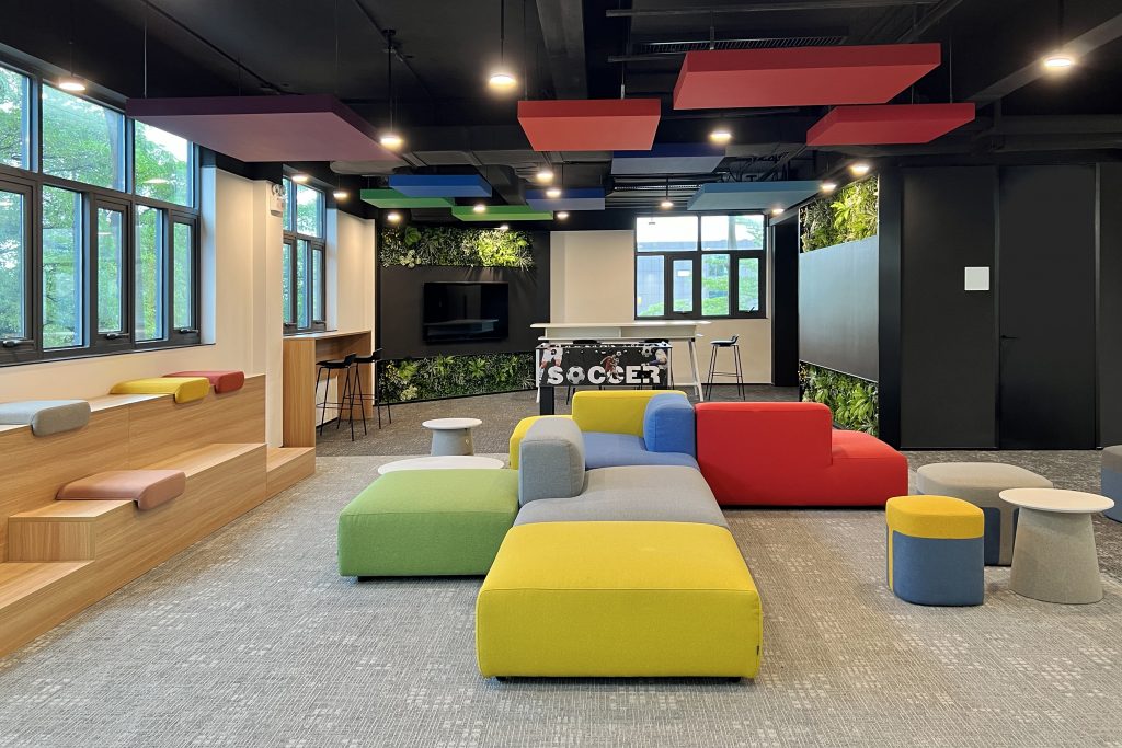
The core concept for the third floor corporate office space revolves around an open space layout. Here, casual meeting areas and relaxation zones effortlessly intertwine, promoting a dynamic and collaborative work environment. Visual separation between these areas is artfully achieved through the strategic use of color patterns on gray-toned carpet tiles and a variegation of ceiling treatments according to functions.
The design of the Bosch Shenzhen Headquarters exemplifies our commitment to merging functionality, aesthetics, and brand identity, creating a workspace that inspires creativity, innovation, and collaboration.
Project Planning
The involvement of the C-suite was integral to the planning process. Six months prior to the effective design development, several options were provided for both the interiors and the architecture renovation, in order for them to assess benefits and costs, and define the proper budgeting to allocate. The leadership at Bosch, both local and international, actively participated in shaping the vision and goals for the renovation project. Their insights, priorities, and strategic objectives played a crucial role in defining the overall direction and functional organization of the project. The C-suite’s engagement ensured that the design aligned with the company’s requirements, values, and business objectives. Eventually the selection process of the design & build team occurred through a bidding process, for which LAPIS BUREAU was selected for the final appointment.
To ensure the project’s success and to create a workspace that resonated with the employees, extensive efforts were made to gather input from the workforce. Prior to planning the interiors, pre-planning surveys were conducted onsite to understand employee preferences, needs, and expectations for the new office space. The feedback received from employees during these surveys was invaluable in tailoring the design to meet their requirements, as much as the detailed information regarding their corporate standards in terms of wellbeing, lighting, acoustics, color codes, etc. that were provided as a manual to the design team.
Several unique design requirements emerged from Bosch’s guidelines for the project. Special attention was given to aligning the interior design with the latest brand guidelines released in 2023; this involved in-depth research to understand the specific visual elements, color schemes, and patterns that would reflect Bosch’s evolving identity, and how to apply them to the architecture and interiors that were being designed.
Additionally, the incorporation of green walls in areas where staff casually meet involved specialized research. Beyond aesthetics, the green walls were intended to promote a positive atmosphere and enhance acoustic performance, requiring considerations related to plant selection, maintenance, and their impact on well-being.
Lastly, the client intended to have a showroom space and lobby that could tell the story not only of the brand itself and their corporate values, but also storytelling the development of the industrial campus and how it expanded and grew over the years. Being that the production here in Shenzhen is mostly dedicated to automobile parts, a sculptural wall was created resembling a windshield fading into extruded frames and cubes, showcasing the main milestones achieved over the years.
The unique design requirements stemmed from a combination of aligning with Bosch’s brand evolution, integrating specific corporate identity elements, spatial requirements and technical performances targeting corporate standards, while incorporating elements backed by research to enhance the overall well-being and functionality of the workspace.
Project Details
Ceiling Innovation
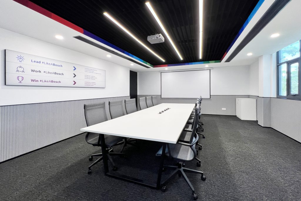
The ceiling design plays a pivotal role in creating an engaging atmosphere. A raw, entirely black ceiling conceals cables and equipment, maintaining a sleek and clutter-free aesthetic. In some areas, an extra layer of metal slabs or acoustic panel stripes was introduced to create a faux ceiling, such as in the offices and meeting spaces.
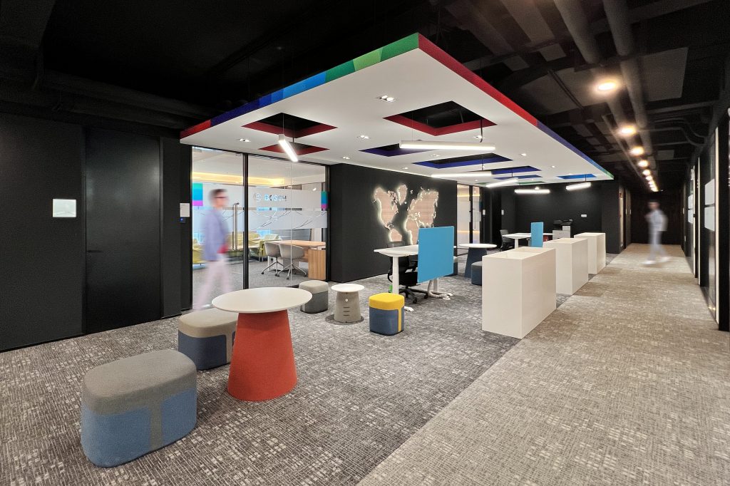
In the open workspace area, a lowered, suspended white ceiling adorned with squared holes was employed. These apertures serve dual purposes, allowing for hanging lamps and housing air conditioning systems. Each hole’s edge is tastefully painted in one of the colors from Bosch’s corporate identity gradient palette.
Visual Continuity and Fractal Fluency
The distinctive pattern of geometries suspended in the ceiling subtly extends to the entrance wall and is resembled in a micro scale as a pattern in the carpet tile design. Inspired by nature’s fractals, this “fractal fluency” pattern not only adds an aesthetic appeal but also reduces physiological stress levels. It engages observers’ eye movements while walking through spaces, mirroring the calming effect of staring at nature.
Transparency and Collaboration
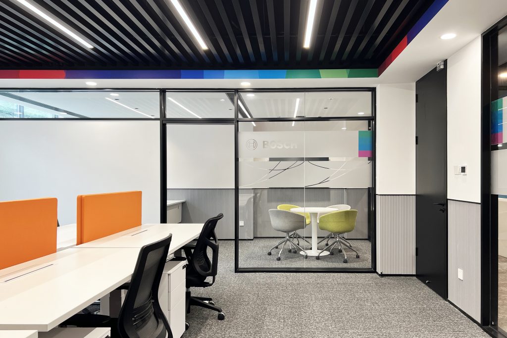
Even in enclosed spaces, such as the director offices and HR and financial departments, transparency remains a key theme. Glass walls offer visual connectivity throughout the office, emphasizing the ethos of open collaboration and transparency. Custom patterns applied as stickers on the glass partitions as well as the signage and intuitive infographics without text allow easy navigation throughout the building, enhancing the inclusivity aspects and considering the multi-faceted nationalities and spoken language of different employees.
Vertical Wall Surfaces
The vertical wall surfaces are thoughtfully articulated to enhance both aesthetics and functionality. In circulation areas, a plain white paint finish promotes a sense of openness.
Within the offices and meeting rooms, white patterned wallpaper and matte pvc surfaces were employed. The textured finishes elevate the materiality of the space while the pvc also provides practicality. The matte pvc surfaces double as whiteboards and magnetic walls, facilitating extensive interactivity and collaboration among employees in different areas, from the meeting rooms and closed offices to the open areas and communal zones.
The foyer showcases the Bosch corporate colorful gradient pattern as a backdrop to a set of magnetic panels, creating a versatile communication board for all staff. This very same gradient, in its grayscale version, graces the walls of the two director offices, adding an intriguing yet sophisticated corporate visual to the space.
In areas where staff have the opportunity to casually meet, extensive green walls for wellness provide more than just aesthetics. They offer a positive atmosphere, transmitting positive emotions and enhancing acoustic performance, contributing to a healthier and more productive workspace.
Color Palette and Brand Identity
A neutral color palette was intentionally selected for envelope surfaces, with dark ceilings, white walls, and gray-toned flooring creating a calming backdrop. Vibrant accents are introduced through furniture and decorative elements, applying Bosch’s corporate gradient pattern to the crown edge of faux ceilings and on the vertical surfaces of communal areas such as corridors, foyers, pantry backlash, outdoor glass canopy, etc. This not only adds a refreshing pop of color but also establishes a visual identity that is uniquely Bosch.
Architectural Design
The existing building presented challenges with its faceted and uneven perimeter, marked by cut corners, a full-height curved glass on the main elevation, and exposed technical equipment across the facade. Our design intervention focused on simplifying the perimeter into a cohesive rectangular footprint. By eliminating curved protrusions and uncoordinated additions, we achieved a streamlined and modern facade. Cut corners were clad with a grid of metal panels, concealing essential ducts and tubes within the resulting invisible space.
For the three secondary elevations, we achieved uniformity by organizing the modularity of window openings and applying a painted plaster coating that mirrored the rhythm of the metal panel grid, while the west-facing main elevation underwent a distinctive transformation instead. Employing ALUCOBOND aluminum panels, we created a dynamic interplay of large vertical bands with varying inclinations. This not only optimized shadow casting factors but also enhanced views from within while imparting a modern aesthetic. This elevation was strategically designed to elevate the architecture in hierarchy, establishing itself as the main building within the campus.
As part of the facade intervention, the envelope was raised by three meters, creating a faux fourth floor. This architectural choice not only added a layer of privacy but also provided shade and weather protection to the accessible rooftop garden. Importantly, it altered the perceived volume in perspective, aligning it with the height of the adjacent large factory building, contributing to a harmonious architectural landscape scenario.
Featured Products:
Furniture procurement: Arch17
Lighting system: OPPLE
Carpet tiles flooring: MOHAWK
Canteen furniture : ZOIFUN
Kitchen equipments : HEAVYBAO
Custom decorations : QZY MODELS
Materials procurement : SEAHAWK BUILDING MATERIALS
Overall Project Results
Marco Morea, Vice President at Robert Bosch GmbH, Plant Manager Mobility Aftermarket China Shenzhen share’s his thoughts on the project results –
In over 25 years of experience within BOSCH corporation, I know well how challenging it can be to introduce a comprehensive design transformation and relocation of operations, particularly in terms of change management and adaptation. In this specific case not only did we intend to drastically change our spatial working scenario from a more traditional “set of office boxes and departments” into a more fresh and modern open space, complying with internal corporate standards, but we also strived to align with the latest corporate brand and visual identity guidelines, that were released during the initial phases of the design process with the Lapis Bureau team, and for which I am very proud to say here in Shenzhen we have achieved the very first BOSCH headquarter office worldwide applying and showcasing our new corporate identity.
One of the notable aspects was adjusting the mindset of our employees to embrace a more open and collaborative workspace. The shift from traditional closed-off offices to an expansive open layout required effective communication and support to address any initial concerns about noise levels, privacy, lighting, energy saving, and the overall change in the working environment.
Since the early stages of the design process together with the architects, we were able to identify pain points and possible implementations, and throughout the design process with them we could assess how the design was satisfying our corporate standards and how well the new space would have aligned with our individual work preferences. These regular updates and feedback were instrumental in keeping everyone informed and engaged throughout the process, particularly in fine-tuning certain aspects of the design and ensuring that it met the diverse needs of the workforce.
The most surprising results of the renovation emerged once our staff finally moved in, and from the overwhelmingly positive response to the design changes. Employees embraced the open layout, and the incorporation of green walls and nature-inspired elements significantly contributed to a positive atmosphere and increased well-being. Furthermore, I could see a greater level of interaction and communication between teams, thanks to the new versatile spatial features and elements like magnetic surfaces and communication boards, that fostered a culture of collaboration and creativity, boosting production and work efficiency, ever since we moved in. The seamless integration of our BOSCH’s corporate identity throughout the space not only provided a visually cohesive environment but also instilled a sense of pride and belonging among the employees.
The design and final results not only met our requirements but exceeded our initial expectations, positively impacting the work culture and overall employee satisfaction.
Key Contributors:
Contractor : Shenzhen Yiyue Construction Group Co., Ltd. / 深圳市艺越建设集团有限公司
Custom decorations : QZY Models
Lighting design : OPPLE
Design
Design by LAPIS BUREAU (LxB)
Freddy Curiél, LxB, partner in charge, landscape/architecture/interiors design lead
Aaron Huang 黄少青, LxB, project manager
Deborah Campana, LxB, facade design
Claire Zhu, LxB, interior design
Maria Vittoria Ferrari, landscape design
Mohamed Mahdy, procurement services
Photography
Photos by LAPIS BUREAU (LxB)
