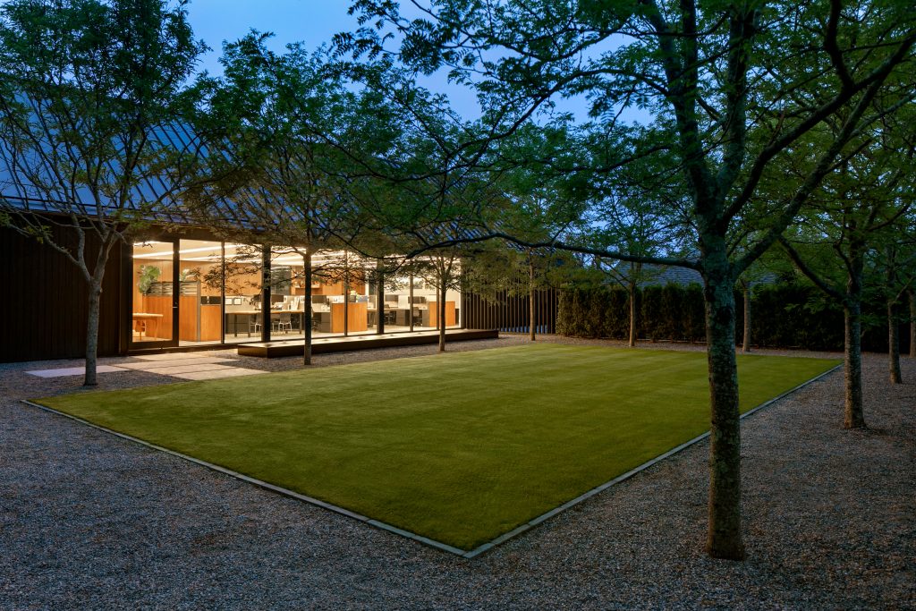
LaGuardia Design Group switches from residential to corporate to design their new office in Water Mill, NY.
Project Overview:
- Design Firm: LaGuardia Design Group
- Client: LaGuardia Design Group
- Completion Date: 2024
- Location: Water Mill, New York, USA
Having spent decades designing landscapes for homes in the Hamptons, Chris LaGuardia enjoyed the privilege of choosing some of his favorite collaborators, now professional and personal friends, to design his office. Accordingly he asked Viola Rouhani of Stelle Lomont Rouhani Architects to design the building. He asked David Scott, interior designer, to design the interiors, and he asked Nathan Orsman to design the lighting. Richard Dunphy, was the general contractor, the sculptures in the office were done by artist Dick Shanley, and the paintings in the office were done by Paton Miller.
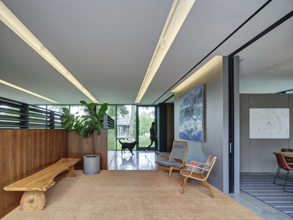
The building, as noted above, was designed specifically for the LDG office; it is a simple box shape. The roof is zero-maintenance metal with skylights cut out, and the facade is Shou Sugi Ban, Japanese charred wood. It looks rather dark from the front exterior, even as it relates in scale to Hamptons architecture, echoing the form of a barn, a ubiquitous building type in the Hamptons. But the back wall is entirely window-walls and sliding doors opening to a lawn/garden, so the office is light-filled and porous to the outdoors.
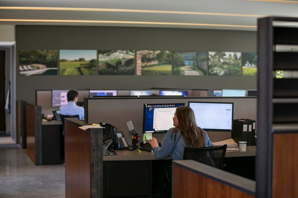
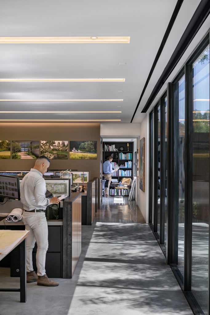
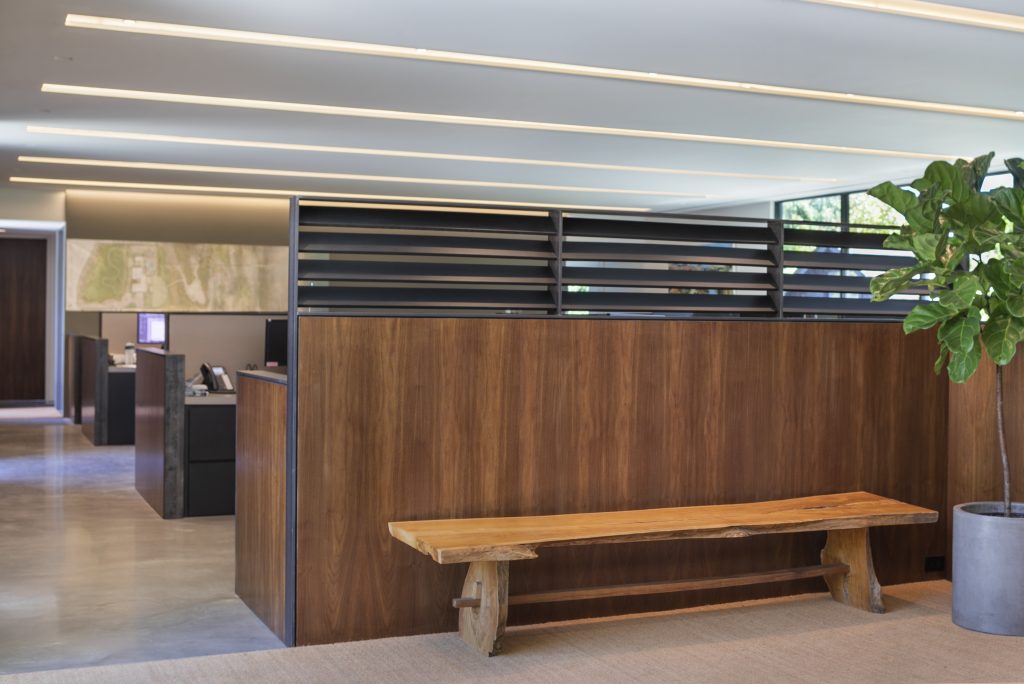
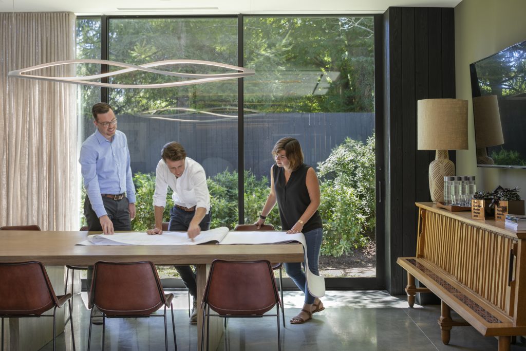
The interior is organized as open plan, with public spaces and conference rooms on the ends and an open center. The main space is defined by Core-Ten steel partitions, a poured concrete floor and walnut millwork. David Scott, the interior designer, leaned toward mid-century modern furnishings. The ceiling panels establish a linear pattern, supplemented by light fixtures selected by Nathan Orsman, the lighting designer.
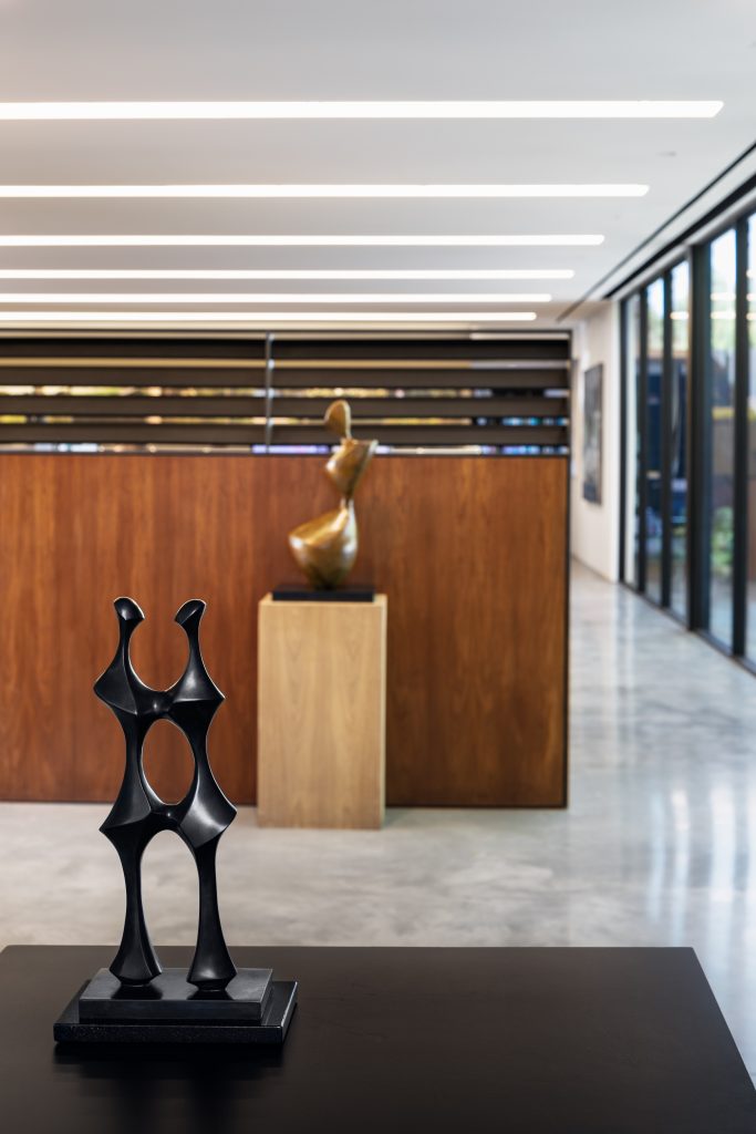
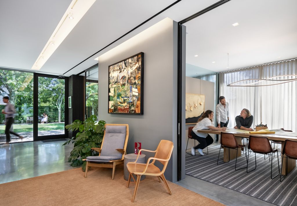
Fine art in the form of sculpture and painting was mostly chosen by Chris LaGuardia, the founding principal, including sculptures by his friend Dick Shanley, a local sculptor, shop teacher – and a disciple of Henry Moore and paintings by his friend Paton Miller.
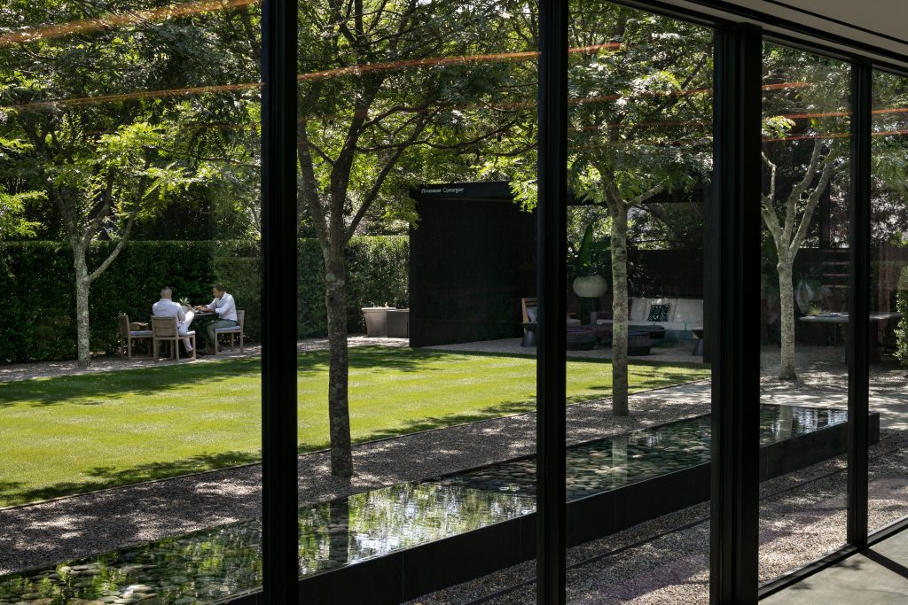
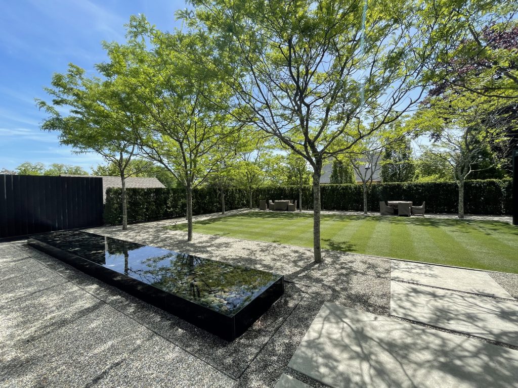
But of course the big idea is that in all but the coldest weather, everyone in the office uses the yard for meetings, meals, exercising their dogs and, sometimes, for games. A large custom-designed pavilion is furnished with upholstered outdoor seating and tables, providing a shaded space in the summer.
Project Planning
This office was designed for (and with) its owners, landscape architects LaGuardia Design Group, so leadership – especially Chris LaGuardia – was intimately involved in its planning. As modernists, they wanted a clean-line, elegant interior. As landscape architects, the outside space and landscape were of primary importance; when weather permits, the staff spends a lot of time outside.
Project Details
Being in a semi-rural environment allows employees to be outside often; the large gesture of including a large backyard, as noted, gives everyone access to the outdoors all the time. Principles of biophilia suggest that even looking through the rear window wall to the grass and trees outdoors, being able to see the wind and weather, and allowing abundant sunshine in all contribute to a sense of wellbeing, higher productivity and wellness. In fact employees can easily walk to the main street of Water Mill for lunch at local restaurants or for take-out.
The architecture, interior design and landscape design coalesce in the rear wall of the building, which is entirely floor-to-ceiling windows and glass doors. Bringing the outside in is a major design gesture of this office, appropriate for landscape architects and playing an essential role in bringing light and air into the workplace.
Because Chris LaGuardia had a personal connection to every member of the design team, the space feels at once very polished and professional but also personal. Chris selected mid-century modern sculpture done by his friend Dick Shanley and abstract paintings by his friend Paton Miller to add color and sophistication to the office, balancing its emphasis on the outdoors.
David Scott, the interior designer, established a modernist aesthetic from the beginning, in keeping with the work of LaGuardia Design. Walking into the office sends every visitor the subliminal message that the work is orderly, the thinking clear and the designs clean.
Products
- Building facacde: Nakamoto Forestry
- Shou Sugi Ban burnt wood siding
- Polished concrete floors with radiant heat
- Black Walnut paneling and cabinets
- Cold-rolled steel desk trim
- Chris LaGuardia’s Desk: Vintage Herman Miller by Knoll
- Office Chairs: Vintage Poul Jensen Z chairs
- Conference room credenza: French Oak from Guillereme et Chambron
- Conference room lamp: Mid-century, by Eva Alofe
- Rug: Handwoven by Edward Fields
- Outdoor Arbor: Resen Carmege
- Outdoor Grill: Art Flame
Overall Project Results
Moving into a new office brought some change to management aspects of the firm. With a much bigger space it feels like there is more going on simultaneously and that staff is able to do more on any given day. In hindsight, had the design team foreseen Covid and the way work shifted, the team would have designed more zoom/meeting rooms so that there would be acoustic separation for all the meetings; there is a constant juggle for use of the three conference rooms. Ultimately though, working via zoom is more efficient; the designers used to spend a lot of time going to project sites for meetings that are now remote. Clients are now able to have meetings during the week rather than using up precious time on the weekend, which is a relief for the staff as well.
There have been several post-occupancy benefits. One is that when clients visit the office, its residential scale, sophisticated design and overall feeling often prompt a response of “We want our house to feel like this.” For the same reasons, virtually everyone loves coming to the office five days a week. Only a couple of people use remote work days. The large open plan lends itself to collaboration and camaraderie, as does sitting at the custom 40” x 18’ work table that enables everyone to gather to have lunch together or to assemble for lectures and presentations. Feedback from employees has been very positive. Unsurprisingly the garden is a popular space for lunch and office events and the parking lot doubles as a pickleball court.
Contributors:
General Contractor: Kiwi Construction
Richard Dunphy, President/Owner
Permitting and Expediting: Inter-Science Research Associates
Heating and AC: Arenz Heating
Electric: Cornachio Electric, Southampton, NY
Steel: Tebbens Steel
Glass: Westhampton Glass
Plumbing: North Sea Plumbing
Site work and planting: Renner Landscaping, Sag Harbor, NY
Artwork
Dick Stanley – Sculpture (2)
Paton Miller – Paintings (4)
Laurie Olin – Drawing
Photographs- Alan Ward
Design
Landscape Architecture: LaGuardia Design Group
Christopher LaGuardia
Architect: Stelle Lomont Rouhani
Design Partner Viola Rouhani
Project Manager Jonthan Subject
Lighting: Orsman Design
Nathan Orsman
Interior Design: David Scott Interiors
Photography
Anthony Crisafulli and Matt Carbone
